How to make cards lift as you scroll on a phone
Phones can't hover, so our blog cards used to sit flat on mobile. Here's the small CSS class and IntersectionObserver we use to lift whichever card is in the middle of the screen as you scroll.
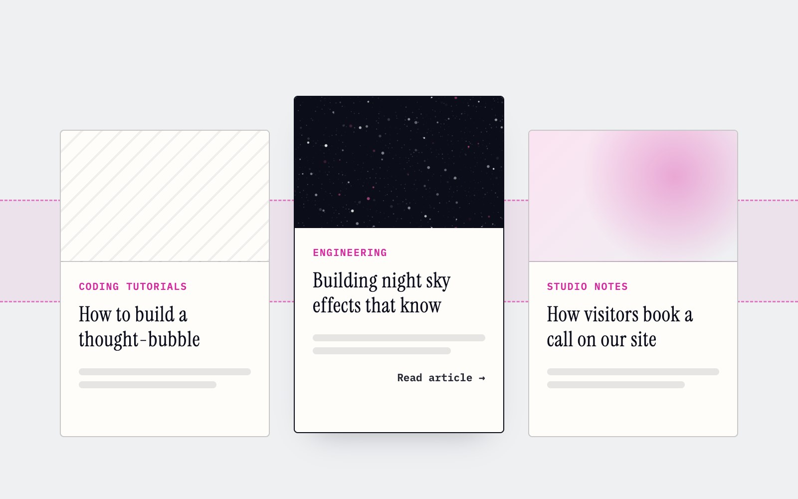
On a laptop, the cards on our tech blog do a small thing we like a lot. Point at one and it rises four pixels, the border goes dark, a soft shadow appears underneath and a Read article arrow slides in. It's a nice hint that the whole card is a link. Then you open the same page on a phone and none of it happens, because a finger doesn't hover. It taps, and by then you're already on the next page. This tutorial is how we gave phones the same lift, triggered by scrolling instead. The starting point is the plain hover version you've probably written a hundred times.
.card {
  display: flex;
  flex-direction: column;
  background: #fffdfa;
  border: 1px solid rgb(11 14 26 / 0.22);
  border-radius: 4px;
  transform: translateY(0);
  transition: transform .18s ease, box-shadow .18s ease, border-color .18s ease;
}

.card:hover {
  border-color: #0b0e1a;
  transform: translateY(-4px);
  box-shadow: 0 16px 32px -20px rgb(11 14 26 / 0.35);
}
The trick is to pull the lifted look out into a class, .is-lifted, that JavaScript can switch on. The class only does anything inside a media query for windows up to 900 pixels wide or devices that report no hover, so a big desktop screen never sees it. Our first attempt skipped JavaScript entirely and used animation-timeline: view(), a scroll-driven animation that runs purely in CSS. On the iPhone we tested, it did nothing at all, and that was the one place we needed it. MDN's compatibility data lists Safari support starting at version 26, so plenty of phones still ignore it. A few lines of script felt like the honest fix.
@media (max-width: 900px), (hover: none) {
  .card.is-lifted {
    border-color: #0b0e1a;
    transform: translateY(-4px);
    box-shadow: 0 16px 32px -20px rgb(11 14 26 / 0.35);
  }

  .is-lifted .card-cta {
    opacity: 1;
    transform: translateX(0);
  }
}The script only needs to know which card is near the middle of the screen as you scroll, and we don't listen to scroll events to find out. An IntersectionObserver does the watching, and its rootMargin of -40% top and bottom shrinks the viewport down to a thin strip across the middle fifth of the screen. Cards report when they enter or leave that strip, we keep them in a Set, and apply() puts .is-lifted on whatever is inside it. The browser does the geometry, so there's no measuring in a loop and the page stays smooth. When the media query stops matching, apply() just clears everything.
const CARDS = '.card'
const small = window.matchMedia('(max-width: 900px), (hover: none)')
let mouse = false
const inBand = new Set<Element>()

const apply = () => {
  const on = small.matches && !mouse
  document.querySelectorAll(CARDS).forEach((el) =>
    el.classList.toggle('is-lifted', on && inBand.has(el)),
  )
}

const io = new IntersectionObserver(
  (entries) => {
    for (const e of entries) {
      if (e.isIntersecting) inBand.add(e.target)
      else inBand.delete(e.target)
    }
    apply()
  },
  // a thin band across the middle of the screen
  { rootMargin: '-40% 0px -40% 0px' },
)
The last part covers the awkward cases. A narrow desktop window matches the media query, but it has a real mouse, and there the lift should follow the pointer like normal. So a pointermove or pointerdown listener checks pointerType, and when it's a mouse the scroll lift steps aside and plain :hover takes over. The cards also change when someone searches, filters or pages through posts, so a MutationObserver watches the page and hands any new card to the observer, with a WeakSet to avoid watching one twice. The component lives in the blog layout and renders nothing. Open this blog on your phone and scroll to watch it.
'use client'

import { usePathname } from 'next/navigation'
import { useEffect } from 'react'

export function CardLift() {
  const pathname = usePathname()

  useEffect(() => {
    // small, mouse, inBand, apply and io from the previous step go here

    const seen = new WeakSet<Element>()
    const watch = () =>
      document.querySelectorAll('.card').forEach((el) => {
        if (seen.has(el)) return
        seen.add(el)
        io.observe(el)
      })
    watch()
    const mo = new MutationObserver(watch)
    mo.observe(document.body, { childList: true, subtree: true })

    const onPointer = (e: PointerEvent) => {
      const isMouse = e.pointerType === 'mouse'
      if (isMouse !== mouse) {
        mouse = isMouse
        apply()
      }
    }
    window.addEventListener('pointermove', onPointer, { passive: true })
    window.addEventListener('pointerdown', onPointer, { passive: true })
    small.addEventListener('change', apply)

    return () => {
      io.disconnect()
      mo.disconnect()
      window.removeEventListener('pointermove', onPointer)
      window.removeEventListener('pointerdown', onPointer)
      small.removeEventListener('change', apply)
    }
  }, [pathname])

  return null
}More articles
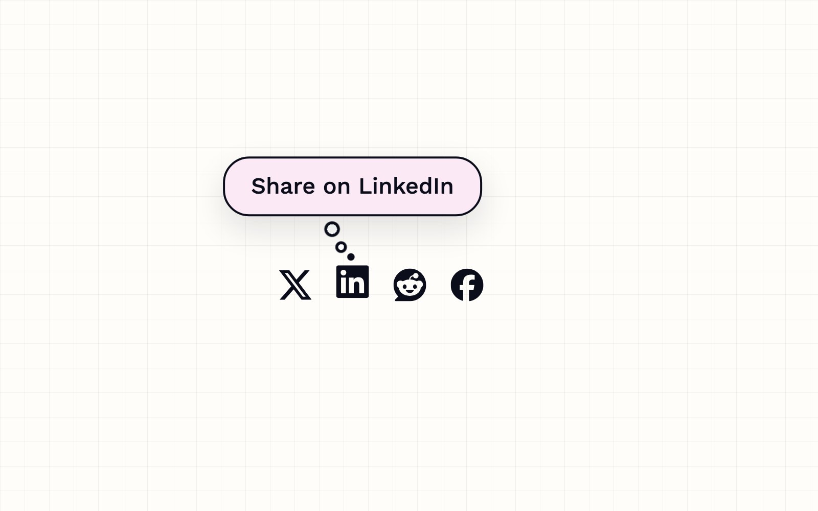
How to build a thought-bubble tooltip with pure CSS
A step-by-step CSS tutorial for a tooltip that reads its label from a data attribute, pops up in a rounded bubble, trails off in three little circles and stays clickable, with no JavaScript.
Meet the Night Sky UI Kit
Three animated React components for dark, night-sky themed sites: a star cursor, a twinkling starfield and a soft aurora glow. Here is what's inside and how to add it.
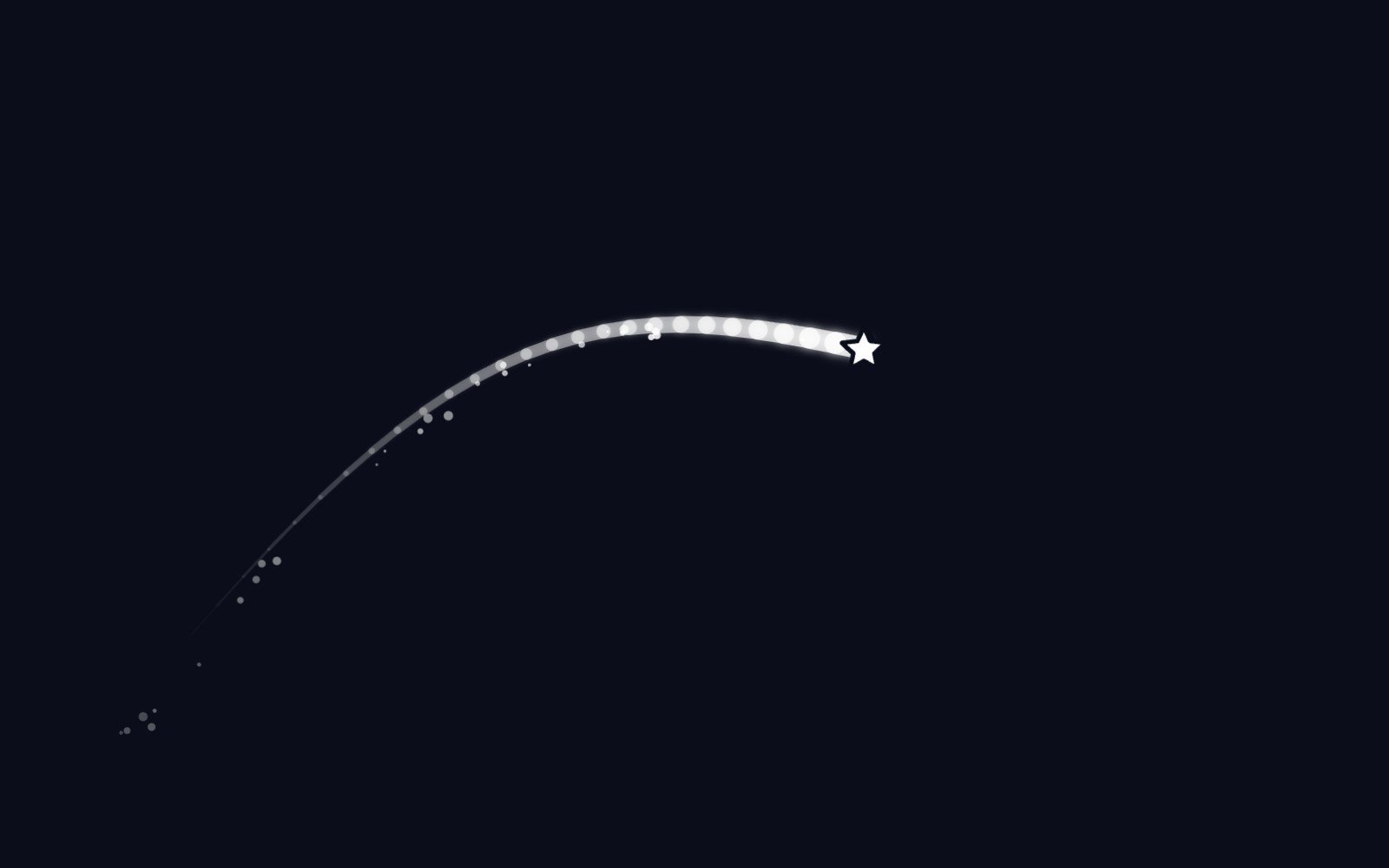
Behind the Star Cursor
How the Star Cursor draws its comet tail and sparkle dust, and why it quietly steps aside on touch screens and for anyone who prefers reduced motion.

The Science of Music
Why a good chorus gives you chills, why the Mozart effect fizzled, and why some songs refuse to leave your head. Here is what the research actually says about music, mood and focus.
What is LaserSETI?
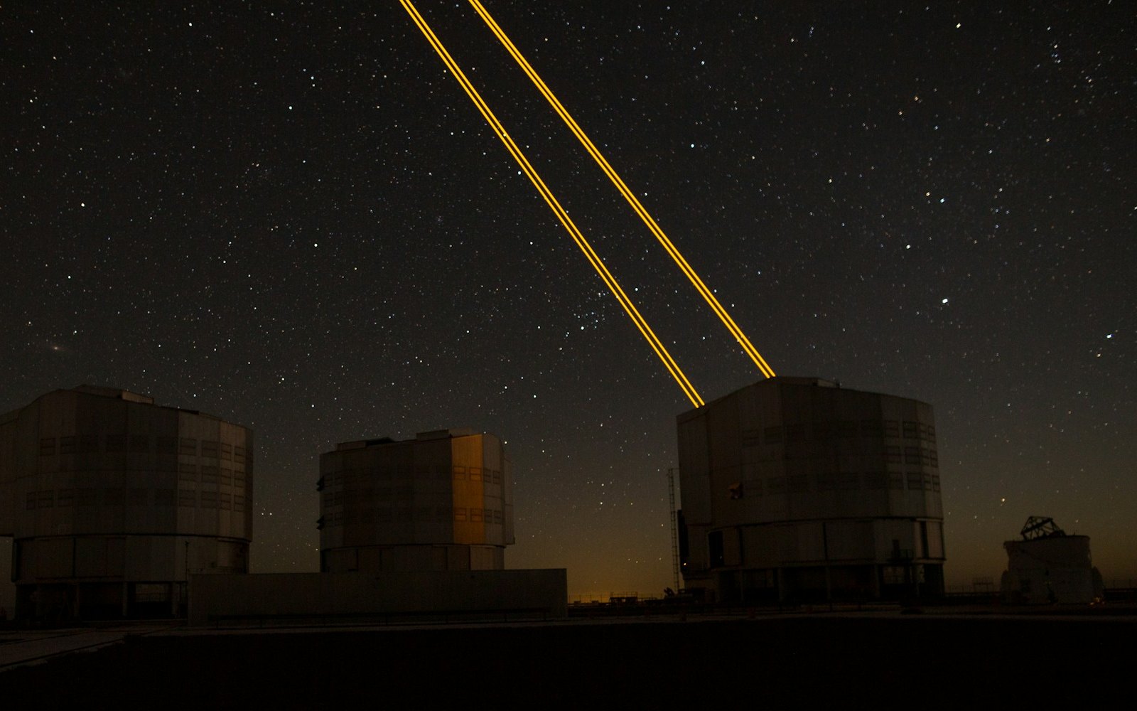
LaserSETI is a growing network of rooftop cameras that watch huge patches of the night sky for a single-color flash of light. Here is how it works, where the stations are in 2026, and what it has (and has not) found.
Most of the Light Around You Is Invisible
Our eyes catch only a thin band of all the light there is, from violet to red. Here is what we miss, which animals see more of it, and how we use the invisible rest every day.
5 trendy UI effects
A star cursor with a comet tail, frosted glass panels, scroll-driven animation, smooth page transitions and gradients that actually move, plus the one tip we would give for each.

What llms.txt is, and how we added one to our site
A plain-English look at llms.txt, the proposed markdown file that gives AI assistants a short map of your site, what it can and can't promise, and how we wrote and tested our own.

Tell Google who you are with a few lines of code
Small business names collide, and search engines have to guess which one you meant. Organization structured data is one way a site owner can stop them guessing. Here's what it is, what we put in ours, and how to test it.
Building night sky effects that know when to sit out
How the Night Sky UI Kit's star cursor, starfield and aurora check the visitor's device and settings before they draw a single frame.

How you can set up pull requests to get an automatic first review
Give every pull request an automatic first review the moment it opens, and send each new pull request and its review to a dedicated Slack channel. Here is how the pieces fit.
How visitors book a call on our site
Picking a time with us takes a few clicks and never leaves the page. Here is how the booking calendar on our site works, and the small checks that stop two people grabbing the same hour.
Inside our resumable, review-gated video production pipeline
How we built a local seven-step pipeline that turns a history topic into a captioned video, with resumable state, bounded retries, and a human review gate.