How to build a dark mode toggle
A step-by-step tutorial for a dark mode that follows your visitor's device setting, adds a toggle button that saves their pick in localStorage, and never flashes the wrong theme on load.
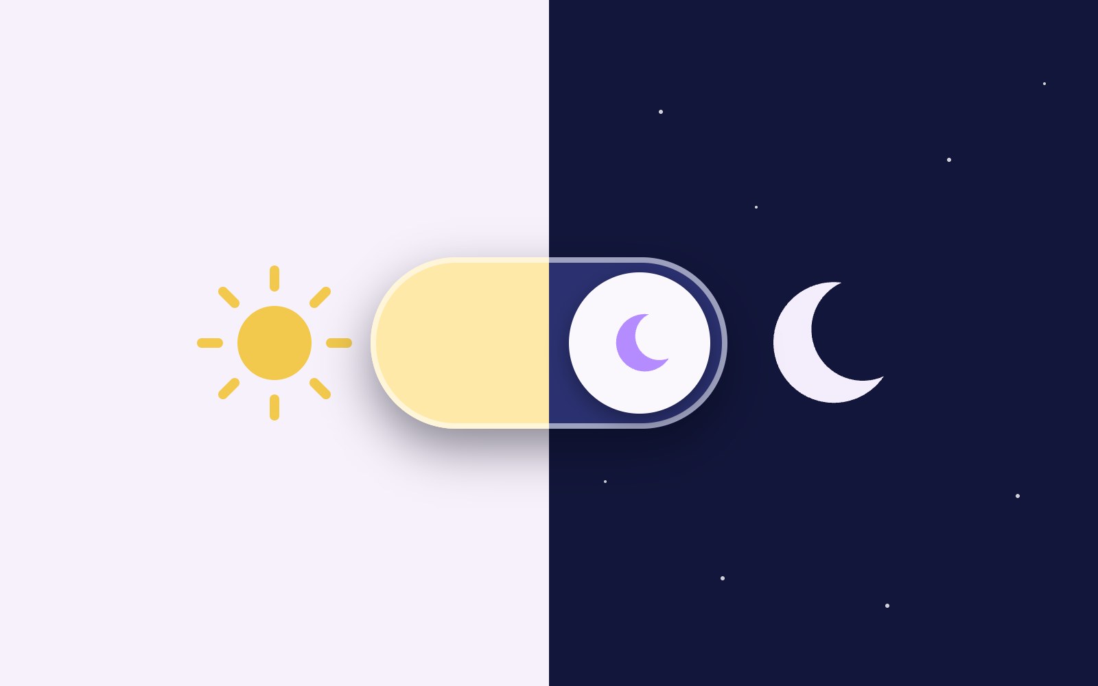
Lots of people keep their phone or laptop in dark mode, and a bright white page can feel like someone flipped on the kitchen light at midnight. In this tutorial you'll build a dark mode that follows the visitor's device setting by default, plus a toggle button that lets them pick light or dark and remembers it on their next visit. You'll also add a button to go back to the device setting, stop the page from flashing the wrong theme while it loads, and make form controls and scrollbars match. It's plain HTML, CSS and a little JavaScript, no framework needed.
Set up your colors as custom properties
Start by giving every color a name. Instead of writing #ffffff all over your stylesheet, you write var(--bg), and the actual value lives in one place. Switching themes then means swapping a handful of variables, not hunting down every rule.
The light colors go on :root. The dark colors show up twice on purpose. The media query block uses them when the device prefers dark and the visitor hasn't forced light. The data-theme block uses them when the visitor has picked dark themselves. That :not([data-theme="light"]) part is what lets a saved choice beat the device setting.
:root {
  color-scheme: light;
  --bg: #ffffff;
  --surface: #f3f3f7;
  --text: #1f1f24;
  --muted: #5c5c66;
  --accent: #c2255c;
}

@media (prefers-color-scheme: dark) {
  :root:not([data-theme="light"]) {
    color-scheme: dark;
    --bg: #16161d;
    --surface: #23232c;
    --text: #ededf2;
    --muted: #a6a6b3;
    --accent: #f783ac;
  }
}

:root[data-theme="dark"] {
  color-scheme: dark;
  --bg: #16161d;
  --surface: #23232c;
  --text: #ededf2;
  --muted: #a6a6b3;
  --accent: #f783ac;
}

body {
  margin: 0;
  font-family: system-ui, sans-serif;
  background: var(--bg);
  color: var(--text);
}

a {
  color: var(--accent);
}
Let color-scheme handle the browser bits
Your custom properties only change things you style. Checkboxes, text inputs, select menus and scrollbars are drawn by the browser, and they'd stay light on a dark page. The color-scheme property tells the browser which scheme you're using, so it can draw those built-in parts to match.
That's why each block in the CSS above sets color-scheme next to the colors. It flips at the same moment the variables do, so you don't end up with a glowing white scrollbar on a dark page.
Add a real toggle button
Use a real button element so it works with a keyboard and screen readers for free. The toggle keeps the same label, Dark mode, and uses aria-pressed to say whether it's on. Screen readers announce it as a toggle button that's pressed or not pressed, which is clearer than a label that keeps changing.
The second button clears the saved choice and hands control back to the device. You can style the pressed state with an attribute selector, so the look and the accessible state never drift apart.
<div class="theme-controls">
  <button type="button" class="theme-toggle" aria-pressed="false">
    Dark mode
  </button>
  <button type="button" class="theme-reset">
    Use device setting
  </button>
</div>.theme-toggle
.theme-reset {
font: inherit;
padding: 0.5rem 1rem;
border: 2px solid var(--accent);
border-radius: 999px;
background: var(--surface);
color: var(--text);
cursor: pointer;
}
.theme-toggle[aria-pressed="true"] {
background: var(--accent);
color: var(--bg);
}
.theme-toggle:focus-visible
.theme-reset:focus-visible {
outline: 3px solid var(--accent);
outline-offset: 3px;
}Save the choice and follow the device
The script works out the current theme in one small function. If data-theme is set, that wins. If not, it asks matchMedia whether the device prefers dark. Clicking the toggle flips to the other theme, puts it on the html element and saves it in localStorage under the key theme.
Clicking Use device setting removes both the attribute and the saved value. Now the CSS media query is in charge again. The change listener on darkQuery keeps aria-pressed honest when someone switches their OS appearance while the page is open. The storage calls sit in try blocks because some browsers block localStorage in strict privacy modes, and a theme button shouldn't break your page.
const root = document.documentElement;
const toggle = document.querySelector('.theme-toggle');
const reset = document.querySelector('.theme-reset');
const darkQuery = window.matchMedia('(prefers-color-scheme: dark)');

function currentTheme() {
  return root.dataset.theme || (darkQuery.matches ? 'dark' : 'light');
}

function updateButton() {
  toggle.setAttribute('aria-pressed', String(currentTheme() === 'dark'));
}

function saveTheme(value) {
  try {
    if (value) {
      localStorage.setItem('theme', value);
    } else {
      localStorage.removeItem('theme');
    }
  } catch (e) {}
}

toggle.addEventListener('click', () => {
  const next = currentTheme() === 'dark' ? 'light' : 'dark';
  root.dataset.theme = next;
  saveTheme(next);
  updateButton();
});

reset.addEventListener('click', () => {
  delete root.dataset.theme;
  saveTheme(null);
  updateButton();
});

darkQuery.addEventListener('change', updateButton);

updateButton();
Stop the flash of the wrong theme
If you only load the saved theme in a script at the bottom of the page, the browser paints the default theme first and then switches. On a slow connection that looks like a bright blink. The fix is a tiny inline script in the head, placed before your stylesheet, that sets data-theme before anything is drawn.
Keep it tiny and inline, not in a separate file, because the browser has to run it before it paints. It only reads the saved value and sets the attribute. Everything else can stay in your main script at the end of the body.
<!doctype html>
<html lang="en">
<head>
  <meta charset="utf-8">
  <meta name="viewport" content="width=device-width, initial-scale=1">
  <title>Dark mode demo</title>
  <script>
    (function () {
      try {
        var saved = localStorage.getItem('theme');
        if (saved === 'light' || saved === 'dark') {
          document.documentElement.dataset.theme = saved;
        }
      } catch (e) {}
    })();
  </script>
  <link rel="stylesheet" href="styles.css">
</head>
Try the shorter light-dark() version
Modern browsers also support a light-dark() CSS function. You give it two colors, and it picks one based on the active color-scheme. With color-scheme set to light dark on :root, it follows the device, and your data-theme rules only need to change color-scheme.
MDN marks light-dark() as Baseline 2024, newly available, so older browsers won't understand it. If you need to support them, stick with the custom property version above. The toggle script works the same with either one.
:root {
  color-scheme: light dark;
  --bg: light-dark(#ffffff, #16161d);
  --text: light-dark(#1f1f24, #ededf2);
}

:root[data-theme="light"] {
  color-scheme: light;
}

:root[data-theme="dark"] {
  color-scheme: dark;
}
One tip before you ship it: test with a saved choice and without one. Pick dark, reload, and the page should open dark with no flash. Then click Use device setting, switch your OS appearance, and the page and the button's pressed state should follow along without a reload. If you ever rename the storage key, change it in both the head script and the main script, because a mismatch means the saved choice quietly stops loading.
More articles
How to make a headline type itself out
Build a headline that types itself out letter by letter with a blinking cursor, using plain HTML, CSS and a few lines of JavaScript.
How to add a copy button to code blocks
Add a small Copy button to every code block on your page that copies the code, says Copied for a moment, and tells screen reader users what happened.
How to make a confetti burst on click
A no-library tutorial for a small burst of colorful confetti that pops out from the exact spot where someone clicks a link or button.
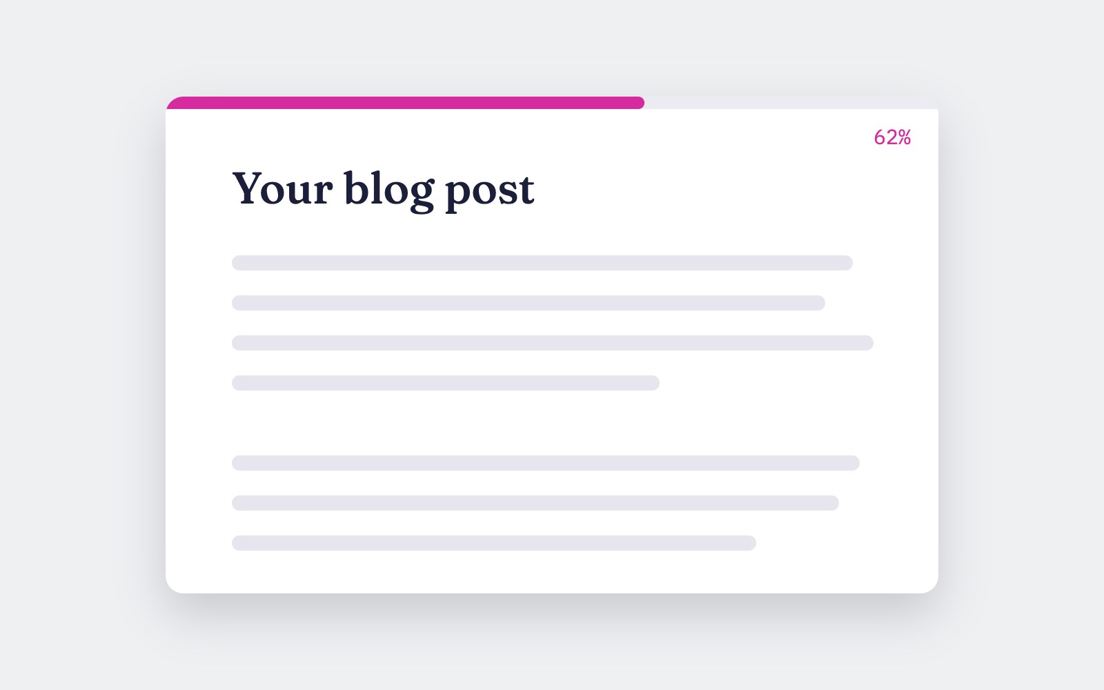
How to add a reading progress bar
Build a thin pink bar that fills across the top of the screen as someone reads your article, with a small JavaScript version and a pure CSS version for browsers that support scroll-driven animations.
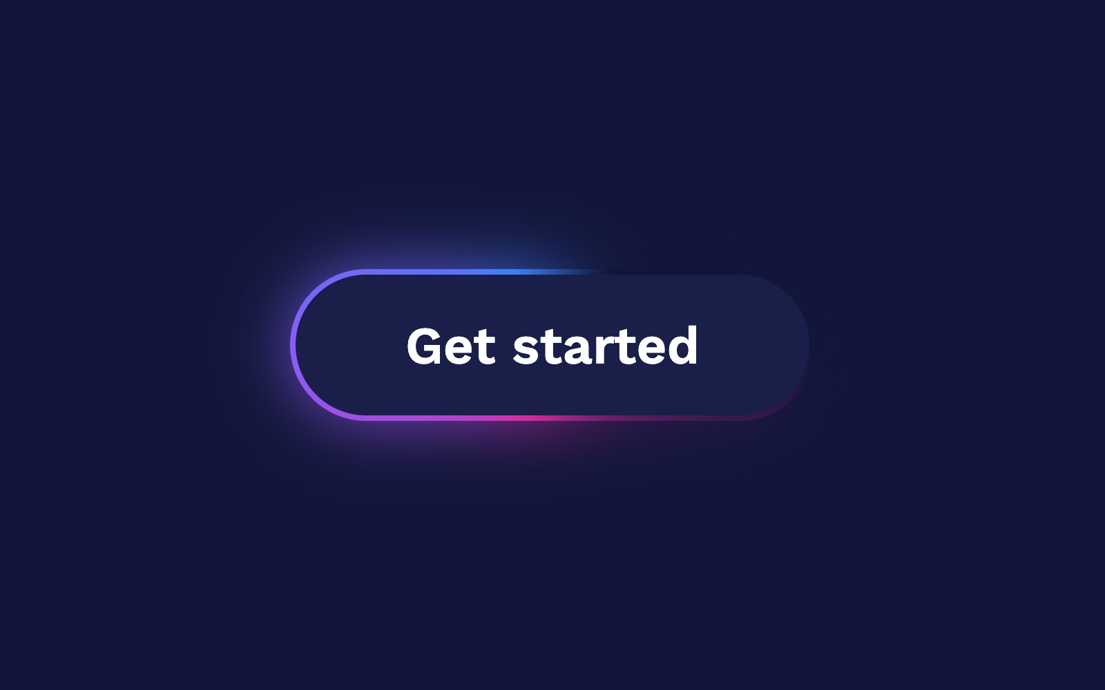
How to make a glowing border spin
A pure CSS tutorial for a card with a pink, purple and blue gradient border that spins around the edge and glows softly, with a calm static version for people who prefer less motion.
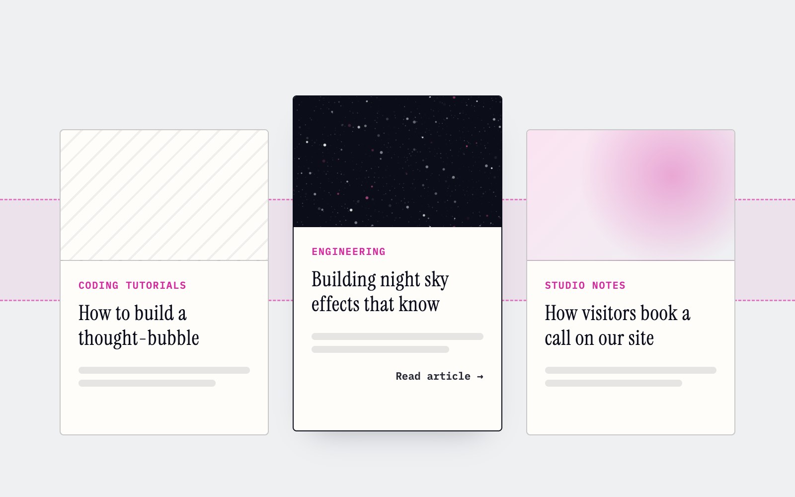
How to make cards lift as you scroll on a phone
Phones can't hover, so our blog cards used to sit flat on mobile. Here's the small CSS class and IntersectionObserver we use to lift whichever card is in the middle of the screen as you scroll.
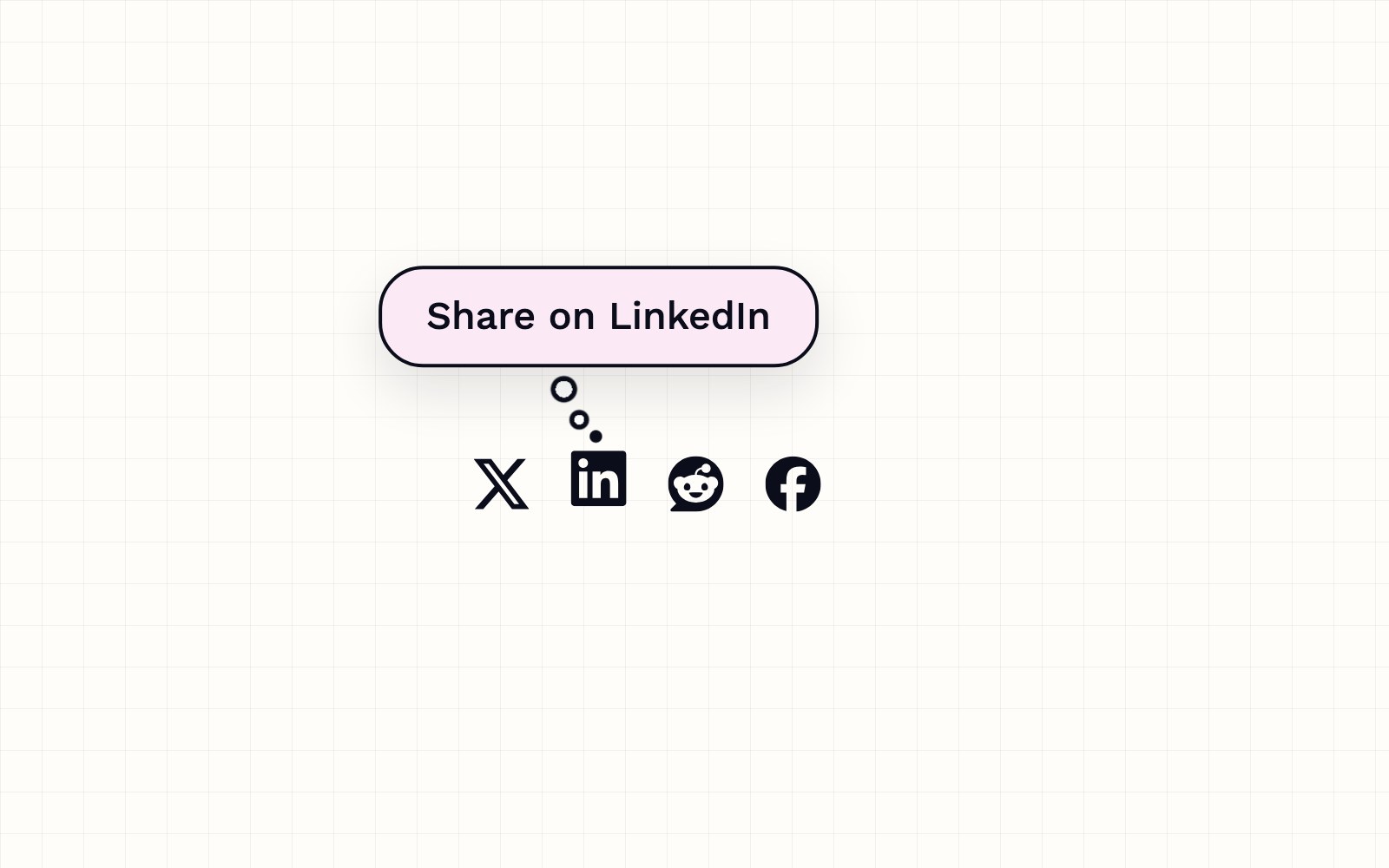
How to build a thought-bubble tooltip with pure CSS
A step-by-step CSS tutorial for a tooltip that reads its label from a data attribute, pops up in a rounded bubble, trails off in three little circles and stays clickable, with no JavaScript.
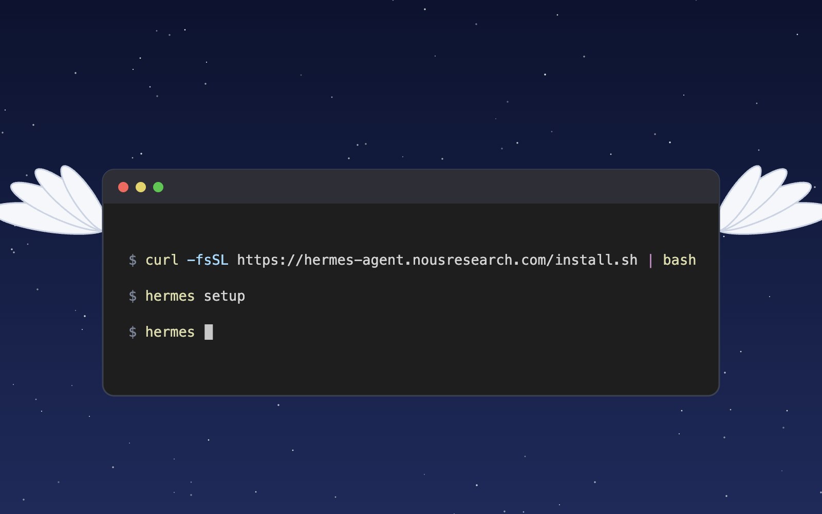
What is Hermes?
Hermes is an open source AI agent harness from Nous Research that runs on your own computer, uses tools, remembers past sessions and learns skills. Here is what it does and how to install and set it up.
Meet the Night Sky UI Kit
Three animated React components for dark, night-sky themed sites: a star cursor, a twinkling starfield and a soft aurora glow. Here is what's inside and how to add it.
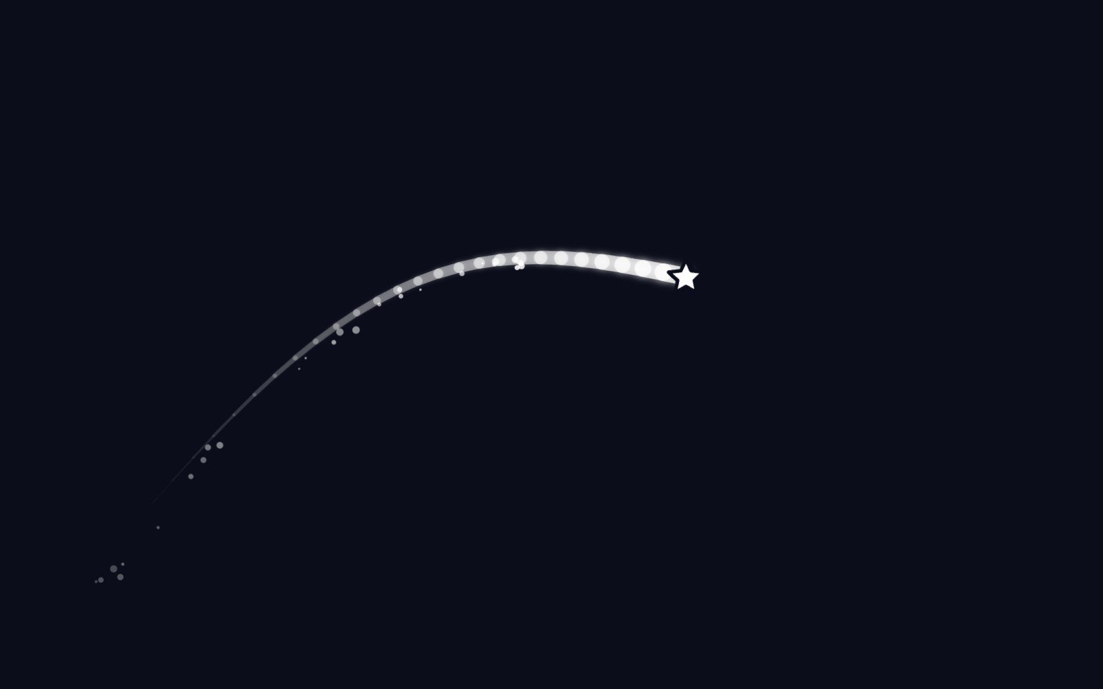
Behind the Star Cursor
How the Star Cursor draws its comet tail and sparkle dust, and why it quietly steps aside on touch screens and for anyone who prefers reduced motion.
The moon is, in fact, an inanimate, dusty old rock
The moon is a layered ball of rock about 4.5 billion years old, wrapped in sharp gray dust and almost no air. Here is what it is made of, where it probably came from and why it barely changes.
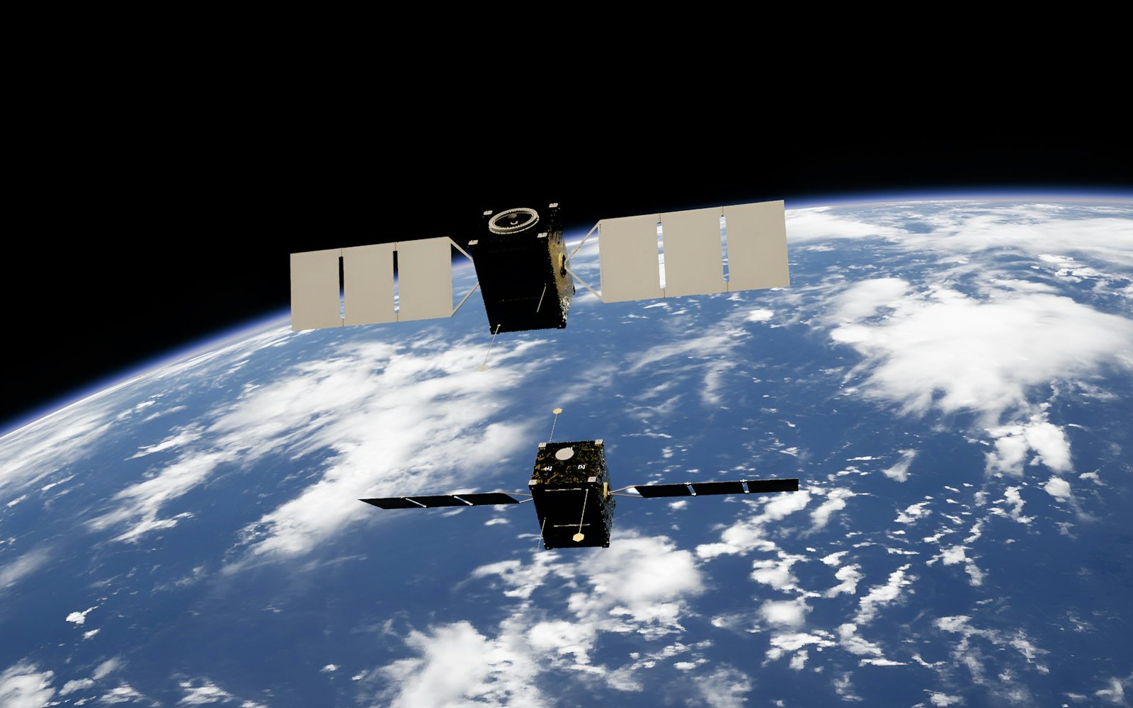
How solar storms mess with satellites
The sun has weather, and some of it reaches us. Here is how solar flares and the storms that follow can sink satellites, scramble GPS and even trip power grids, and how people keep watch.
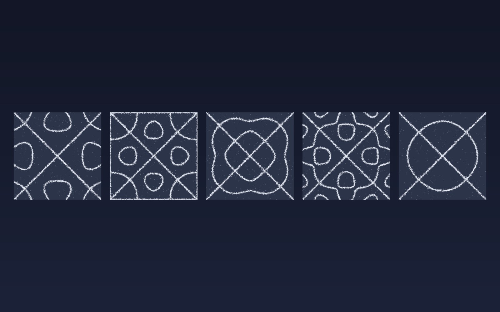
Patterns in sound
Sprinkle salt on a drum, play a steady note, and the grains slide into neat lines and rings. Here is why sound draws pictures, who first noticed, how to try it at home, and what all this has in common with a snowflake.
Most of the sound around you goes unheard
Human ears catch only a middle band of all the sound there is. Here is what we miss, which animals hear it, and why the hums and whines from our own gadgets can still get under our skin.
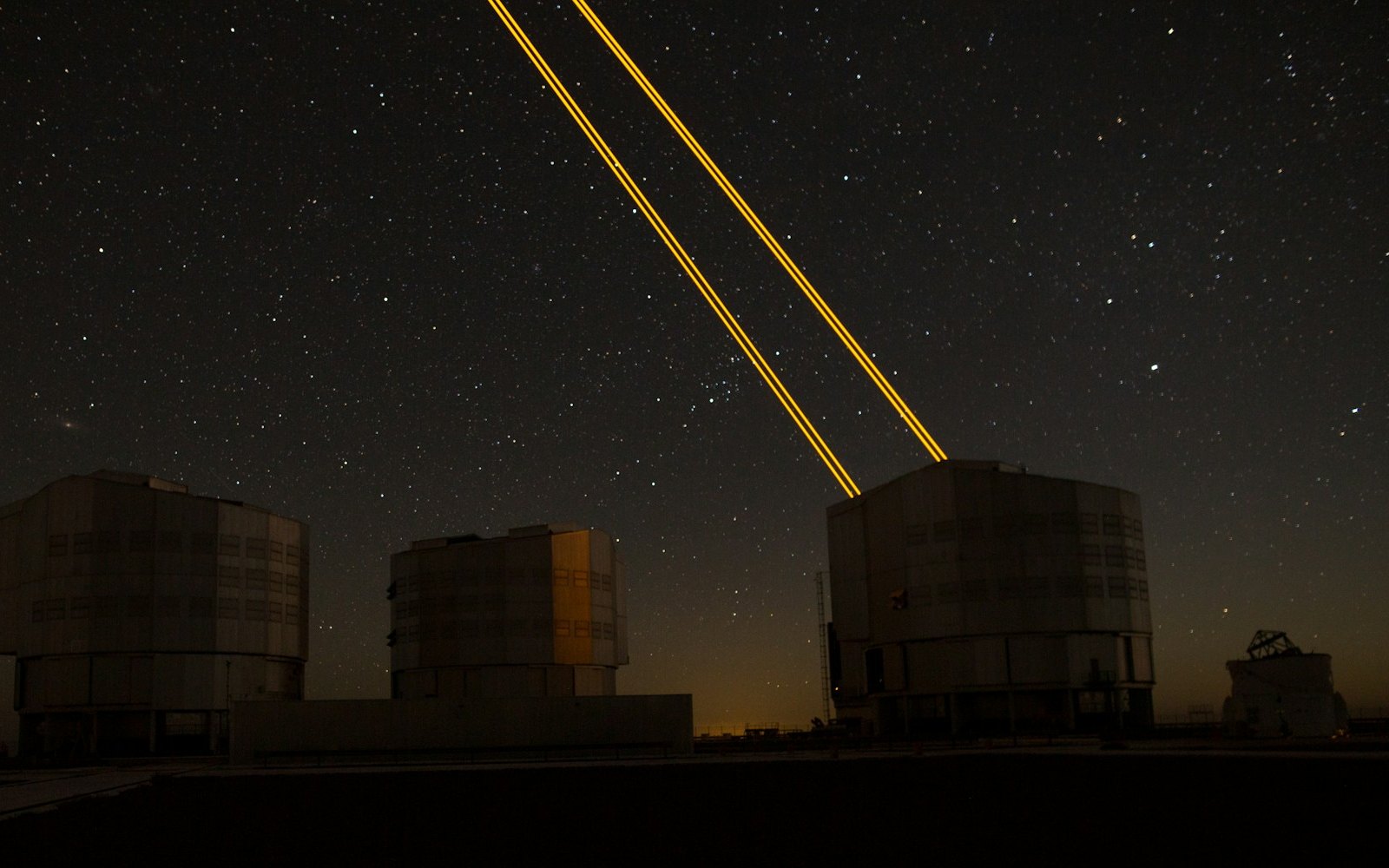
What is LaserSETI?
LaserSETI is a growing network of rooftop cameras that watch huge patches of the night sky for a single-color flash of light. Here is how it works, where the stations are in 2026, and what it has (and has not) found.
Most of the light around you is invisible
Our eyes catch only a thin band of all the light there is, from violet to red. Here is what we miss, which animals see more of it, and how we use the invisible rest every day.
The science of music
Why a good chorus gives you chills, why the Mozart effect fizzled, and why some songs refuse to leave your head. Here is what the research actually says about music, mood and focus.
Bill Nye is still teaching
A science show from the 1990s is still turning up in classrooms. Here is what Bill Nye the Science Guy was, why so many grownups remember it so fondly, and why teachers keep pressing play.
Why is the sky blue?
The sky is blue because the tiny bits of gas in the air reflect blue sunlight around much more than red light, so blue reaches our eyes from every part of the sky.
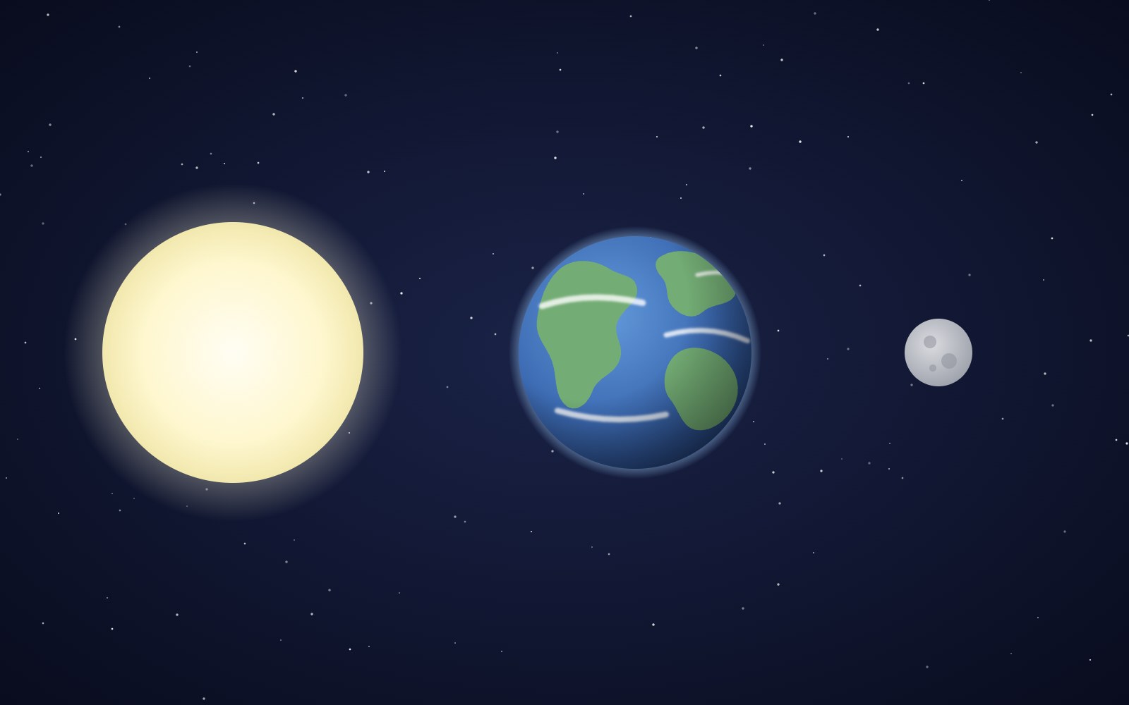
Why the sun and moon look the same size
The sun is about 400 times wider than the moon and also about 400 times farther away, so the two discs look almost the same size in our sky. That match is a coincidence of timing, and it will not last forever.
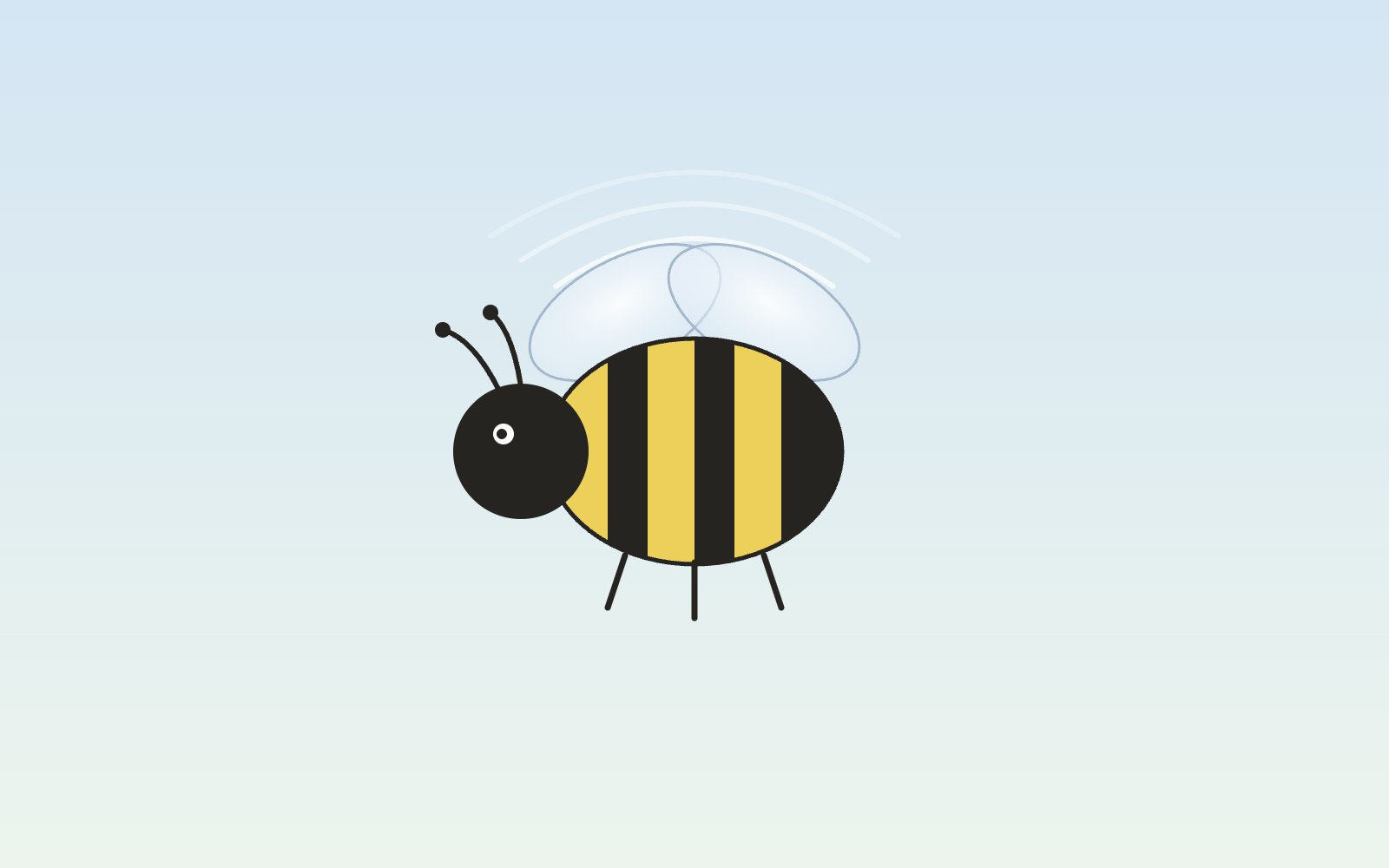
Bees fly more like drones than planes
A bumblebee stays in the air the way a drone or helicopter does, by moving its wings fast instead of racing forward over a stiff wing.
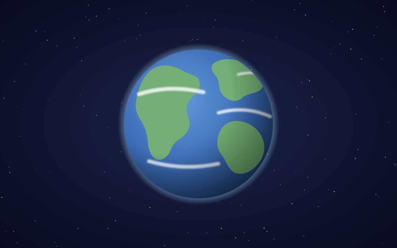
The earth is, in fact, actually round
You can check that Earth is round from a beach, a campsite or a phone call to a friend in another time zone. People worked it out more than two thousand years ago, and one of them even measured it with shadows.
5 trendy UI effects
A star cursor with a comet tail, frosted glass panels, scroll-driven animation, smooth page transitions and gradients that actually move, plus the one tip we would give for each.
What llms.txt is, and how we added one to our site
A plain-English look at llms.txt, the proposed markdown file that gives AI assistants a short map of your site, what it can and can't promise, and how we wrote and tested our own.
Tell Google who you are with a few lines of code
Small business names collide, and search engines have to guess which one you meant. Organization structured data is one way a site owner can stop them guessing. Here's what it is, what we put in ours, and how to test it.
Building night sky effects that know when to sit out
How the Night Sky UI Kit's star cursor, starfield and aurora check the visitor's device and settings before they draw a single frame.
How you can set up pull requests to get an automatic first review
Give every pull request an automatic first review the moment it opens, and send each new pull request and its review to a dedicated Slack channel. Here is how the pieces fit.
How visitors book a call on our site
Picking a time with us takes a few clicks and never leaves the page. Here is how the booking calendar on our site works, and the small checks that stop two people grabbing the same hour.
Inside our resumable, review-gated video production pipeline
How we built a local seven-step pipeline that turns a history topic into a captioned video, with resumable state, bounded retries, and a human review gate.