How to build a thought-bubble tooltip with pure CSS
A step-by-step CSS tutorial for a tooltip that reads its label from a data attribute, pops up in a rounded bubble, trails off in three little circles and stays clickable, with no JavaScript.
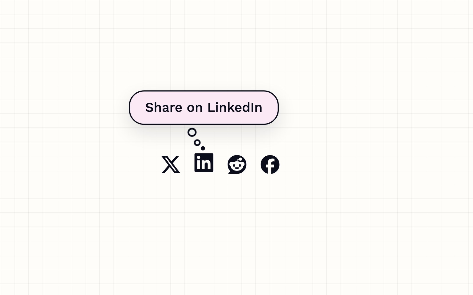
The browser's built-in tooltip, the one you get from a title attribute, is a plain gray box that shows up after a delay and can't be styled. This tutorial builds a custom one with nothing but CSS. The label lives in a data-tip attribute on the link, the ::after pseudo-element draws the bubble, and ::before draws a trail of three circles, like a thought bubble in a comic. It's the same tooltip that sits on the share icons at the top of every article on this blog, so you can hover one to see the finished result. Start with a normal link that has an icon, a data-tip label and an aria-label for screen readers.
<a
  class="share-link"
  href="https://www.linkedin.com/sharing/share-offsite/?url=https%3A%2F%2Fexample.com%2Fpost"
  data-tip="Share on LinkedIn"
  aria-label="Share on LinkedIn"
>
  <svg viewBox="0 0 24 24" aria-hidden="true"><!-- icon path --></svg>
</a>
Give the link position: relative so both pseudo-elements can be placed against it. The bubble uses content: attr(data-tip), which pulls the text straight from the markup, so every icon gets its own label without any extra CSS. It sits above the icon with bottom: calc(100% + 22px), leaving room for the circles, and is centered with left: 50% plus translateX(-50%). white-space: nowrap keeps the label on one line. The background is a light pink tint layered over solid white, which keeps the bubble fully opaque so the page never shows through it.
.share-link {
  position: relative;
}

.share-link::after {
  content: attr(data-tip);
  position: absolute;
  left: 50%;
  bottom: calc(100% + 22px);
  padding: 10px 16px;
  border: 1.5px solid #0b0e1a;
  border-radius: 16px;
  background: linear-gradient(rgb(214 42 159 / .1), rgb(214 42 159 / .1)), #fff;
  color: #0b0e1a;
  font: 500 14px/1 sans-serif;
  white-space: nowrap;
  box-shadow: 0 8px 20px rgb(11 14 26 / .12);
  transform: translateX(-50%) scale(.6);
  transform-origin: 50% 100%;
}The trail of circles is a single ::before element with three radial gradients as its background, one per circle. Each gradient paints a white center, then a dark ring, then transparent, and the circles get smaller as they get closer to the icon. The smallest one is solid. Because the circles are gradients inside one box, you can move any of them just by changing its position, which makes it easy to nudge the trail a pixel or two until it lines up with the bubble.
.share-link::before {
  content: '';
  position: absolute;
  right: calc(50% - 2px);
  bottom: calc(100% - 6px);
  width: 22px;
  height: 26px;
  background:
    radial-gradient(circle at 7.5px 6px, #fff 0 3px, #0b0e1a 3px 4.5px, transparent 5px),
    radial-gradient(circle at 13px 17px, #fff 0 1.8px, #0b0e1a 1.8px 3.3px, transparent 3.8px),
    radial-gradient(circle at 19px 23px, #0b0e1a 0 2px, transparent 2.5px);
  transform: scale(.6);
  transform-origin: 100% 100%;
}
Both pieces start hidden with opacity: 0 and visibility: hidden, and appear on :hover and on :focus-visible, so keyboard users see them too. The small pop comes from a springy cubic-bezier on the transform. Hiding waits 0.15 seconds, which gives the mouse time to travel from the icon up into the bubble. Pseudo-elements belong to their link, so clicking the bubble goes to the same place as clicking the icon. Phones have no hover, so a media query turns the bubble off on small screens and the icon's own hover color does the job there.
.share-link::after
.share-link::before {
  opacity: 0;
  visibility: hidden;
  transition:
    opacity .18s ease .15s,
    transform .28s cubic-bezier(.34, 1.56, .64, 1) .15s,
    visibility 0s linear .35s;
}

.share-link:hover::after
.share-link:focus-visible::after
.share-link:hover::before
.share-link:focus-visible::before {
  opacity: 1;
  visibility: visible;
  transition-delay: 0s;
}

.share-link:hover::after
.share-link:focus-visible::after {
  transform: translateX(-50%) scale(1);
}

.share-link:hover::before
.share-link:focus-visible::before {
  transform: scale(1);
}

@media (max-width: 640px) {
  .share-link::after
  .share-link::before {
    display: none;
  }
}More articles
Building night sky effects that know when to sit out
How the Night Sky UI Kit's star cursor, starfield and aurora check the visitor's device and settings before they draw a single frame.

How Romeo learned to answer to its own name
Romeo ships a custom-trained Hey Romeo wake word, picks the right model format for your hardware, and hands your voice off to capture without extra clicks.

How our pull requests get an automatic first review
A Cloudflare Worker picks up GitHub pull request webhooks, has Claude review the diff, submits a real GitHub review, and posts the notification into the correct Slack channel for pull requests.

How visitors book a call on our site
A look at the site's booking flow: a custom scheduling component, a small two-route API, and the checks that keep a 60-minute call from being double-booked.

Inside our resumable, review-gated video production pipeline
How we built a local seven-step pipeline that turns a history topic into a captioned video, with resumable state, bounded retries, and a human review gate.