Behind the Star Cursor
How the Star Cursor draws its comet tail and sparkle dust, and why it quietly steps aside on touch screens and for anyone who prefers reduced motion.
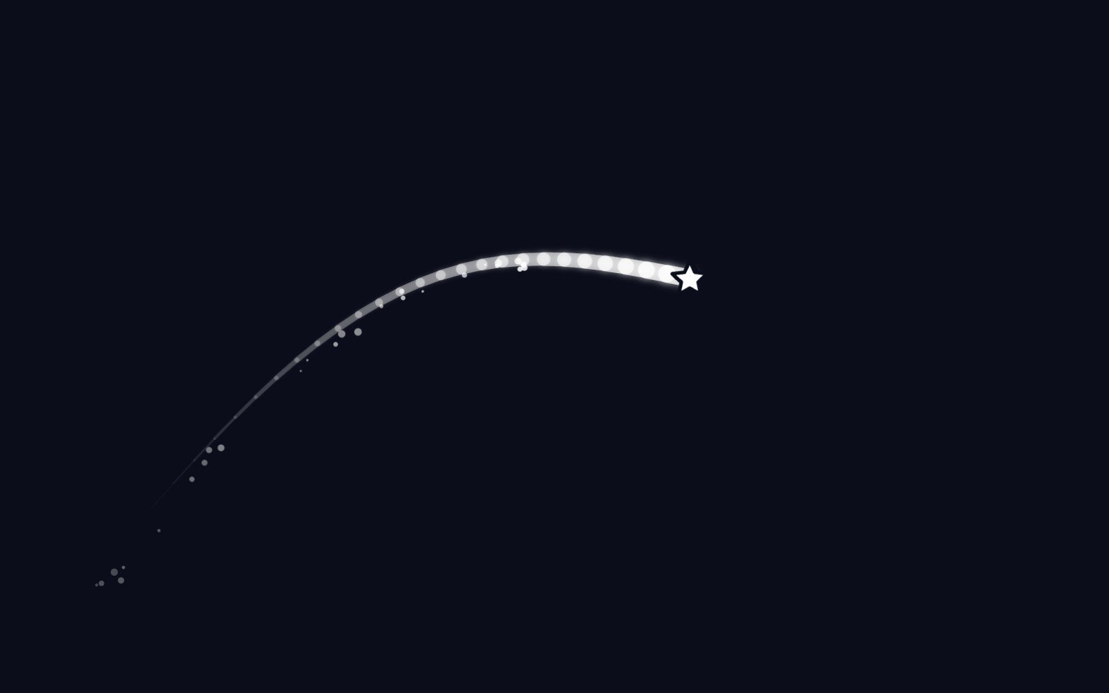
A custom cursor is a strange thing to ship. It replaces the one part of the screen people rely on to know where they are, so it had better earn its place. The Star Cursor tries to earn it by being polite first and sparkly second. Before it draws a single pixel, it asks the browser three questions. Can this device hover? Is the pointer fine, like a mouse or a trackpad? And has the visitor said nothing about wanting less motion? Only when all three answers are yes does the star appear and the normal arrow hide. If any answer is no, the component does nothing at all, and your page looks exactly as it did before.
Here is that check, straight from the component. A phone fails the hover test, so it keeps its ordinary taps. Someone who has turned on reduced motion in their system settings fails the last test, so they keep the plain cursor too. The check also keeps listening. If a visitor switches reduced motion on while the page is open, the component stops, puts the regular cursor back and clears its canvas. Even when the query passes, every pointer move is checked for its type, and anything that isn't a mouse gets ignored. That matters on laptops with touch screens, where a finger and a trackpad share the same machine.
const media = window.matchMedia(
  touch ? '(prefers-reduced-motion: no-preference)' : '(hover: hover) and (pointer: fine) and (prefers-reduced-motion: no-preference)',
)The star itself is a small SVG, 25 pixels by default, with a very dark navy outline. The chunky bottom right edge comes from stacking copies of the star shape, each nudged a little further down and to the right, which reads like a soft offset shadow. The tail lives on a canvas underneath. Every frame, the pointer position goes to the front of a list that keeps the last 30 points by default, and the component draws a line through them that gets thinner and fainter toward the end, with a glow that fades as well. Sparkle dust only shows up when you move quickly. Faster moves shed more specks, and each one drifts gently downward and fades out after about 40 frames.
The rest of its manners are quieter. The star and its canvas are both aria-hidden, so screen readers skip them, and both use pointer-events: none, so every click lands on whatever sits underneath. The star also hides when the window loses focus or the pointer leaves the window. If you do want it on phones, set touch to true and it follows a finger, then hides when the finger lifts. You can try all of this on the Star Cursor page, which has a live preview and a Customize panel for size, outline, offset, colors, tail length, tail width and dust. It costs $9 on its own, or comes with the other two effects in the $19 Night Sky UI Kit.
Night Sky UI Kit
Every effect in this post, ready to drop into a React app.
- Star CursorA star-shaped cursor with an offset outline, a glowing comet tail, and sparkle dust. Turns on only for a mouse and stays off when the visitor prefers reduced motion.
- Night SkyA twinkling starfield for dark sections. Bright stars drift slightly toward the pointer. Draws a single still frame when the visitor prefers reduced motion.
- Aurora GlowSoft coloured lights that slowly drift and pulse behind a section. Draws a single still frame when the visitor prefers reduced motion.
More articles
Meet the Night Sky UI Kit
Three animated React components for dark, night-sky themed sites: a star cursor, a twinkling starfield and a soft aurora glow. Here is what's inside and how to add it.
The moon is, in fact, an inanimate, dusty old rock
The moon is a layered ball of rock about 4.5 billion years old, wrapped in sharp gray dust and almost no air. Here is what it is made of, where it probably came from and why it barely changes.
How solar storms mess with satellites
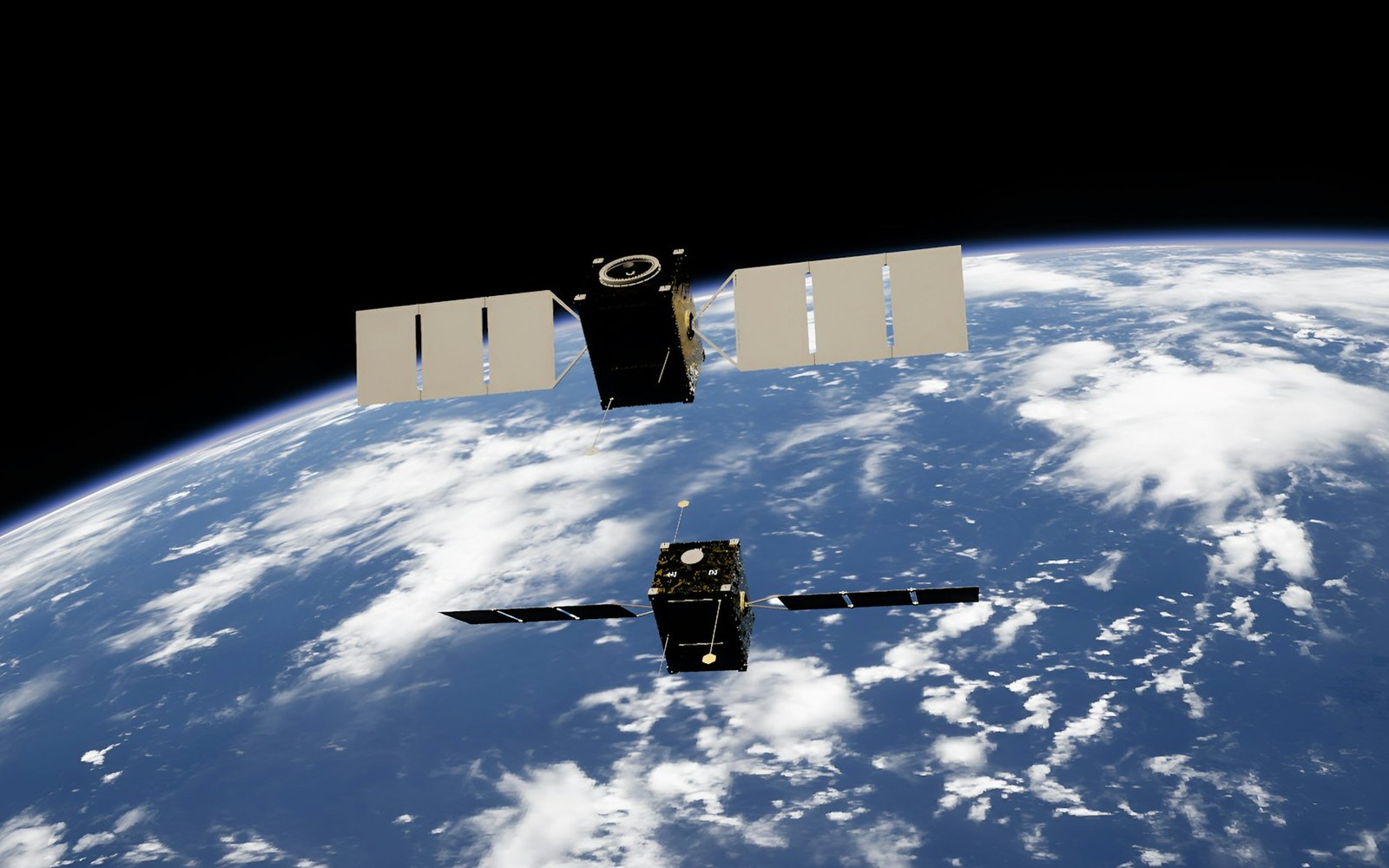
The sun has weather, and some of it reaches us. Here is how solar flares and the storms that follow can sink satellites, scramble GPS and even trip power grids, and how people keep watch.
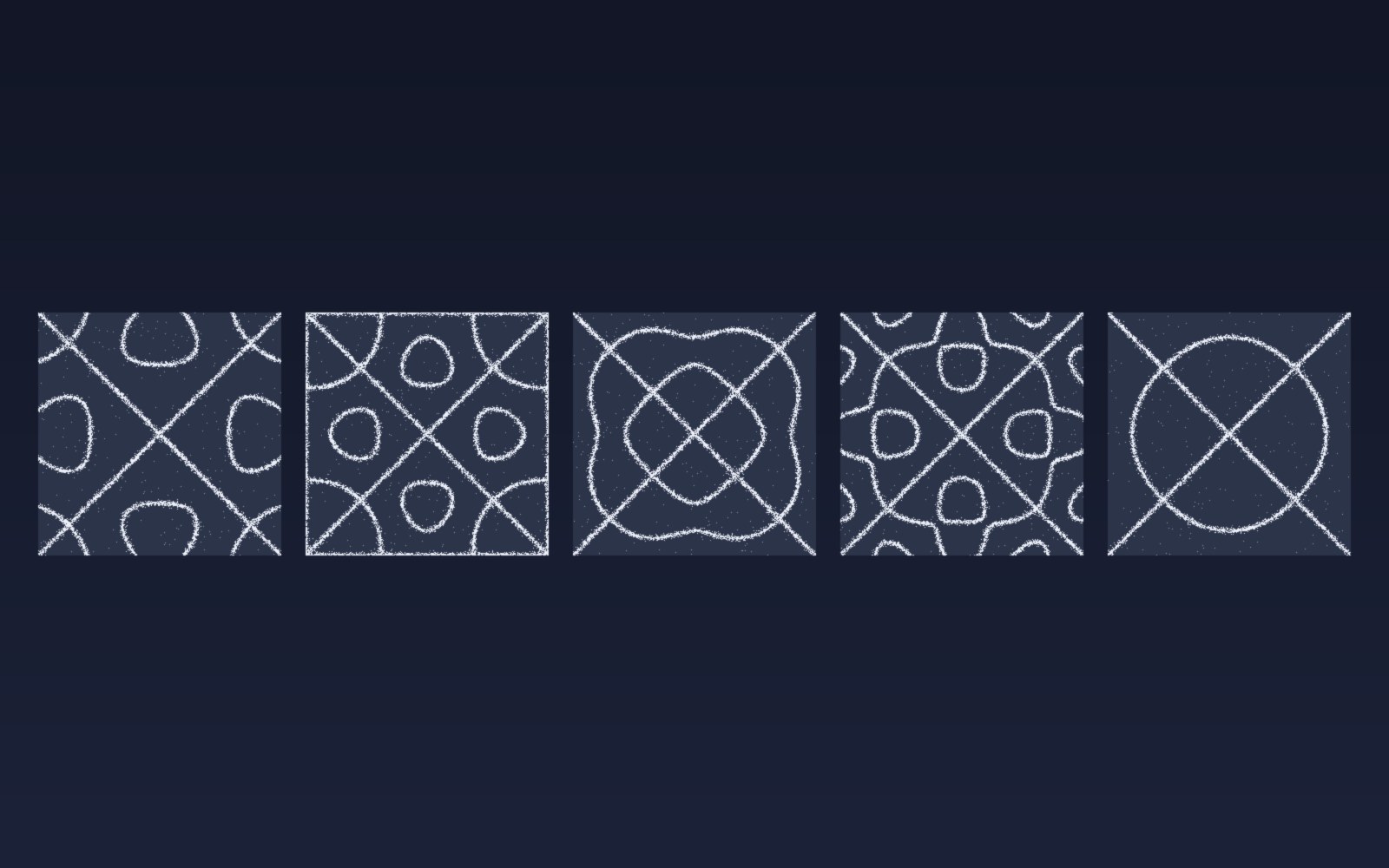
Patterns in sound
Sprinkle salt on a drum, play a steady note, and the grains slide into neat lines and rings. Here is why sound draws pictures, who first noticed, how to try it at home, and what all this has in common with a snowflake.
Most of the sound around you goes unheard
Human ears catch only a middle band of all the sound there is. Here is what we miss, which animals hear it, and why the hums and whines from our own gadgets can still get under our skin.
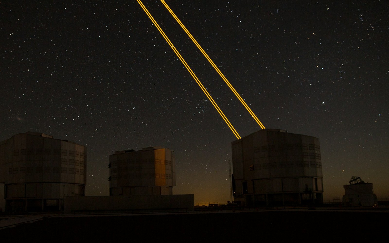
What is LaserSETI?
LaserSETI is a growing network of rooftop cameras that watch huge patches of the night sky for a single-color flash of light. Here is how it works, where the stations are in 2026, and what it has (and has not) found.
Most of the light around you is invisible
Our eyes catch only a thin band of all the light there is, from violet to red. Here is what we miss, which animals see more of it, and how we use the invisible rest every day.
The science of music
Why a good chorus gives you chills, why the Mozart effect fizzled, and why some songs refuse to leave your head. Here is what the research actually says about music, mood and focus.
Bill Nye is still teaching
A science show from the 1990s is still turning up in classrooms. Here is what Bill Nye the Science Guy was, why so many grownups remember it so fondly, and why teachers keep pressing play.
Why is the sky blue?
The sky is blue because the tiny bits of gas in the air reflect blue sunlight around much more than red light, so blue reaches our eyes from every part of the sky.
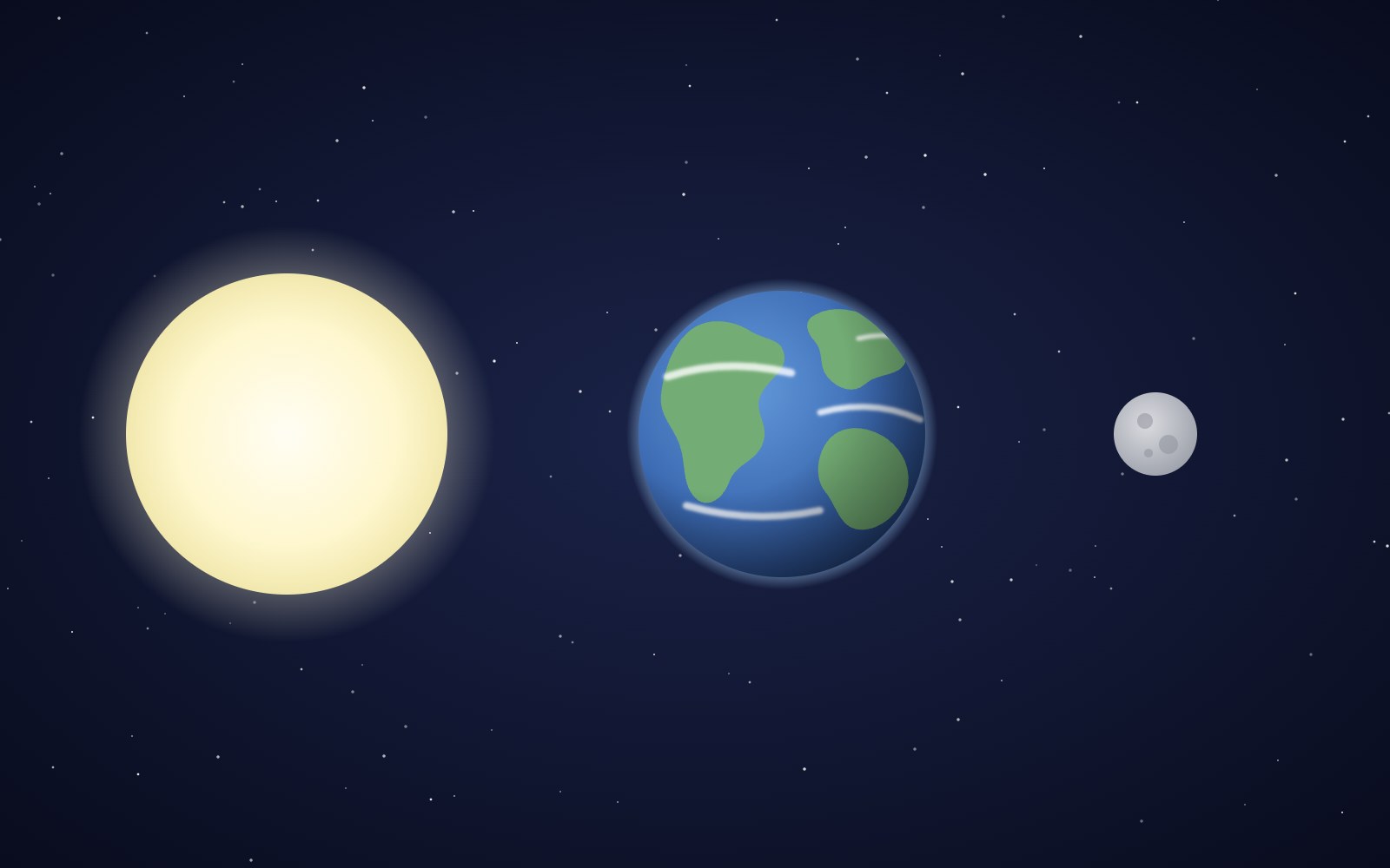
Why the sun and moon look the same size
The sun is about 400 times wider than the moon and also about 400 times farther away, so the two discs look almost the same size in our sky. That match is a coincidence of timing, and it will not last forever.
Bees fly more like drones than planes
A bumblebee stays in the air the way a drone or helicopter does, by moving its wings fast instead of racing forward over a stiff wing.
The Earth is, in fact, round
You can check that Earth is round from a beach, a campsite or a phone call to a friend in another time zone. People worked it out more than two thousand years ago, and one of them even measured it with shadows.
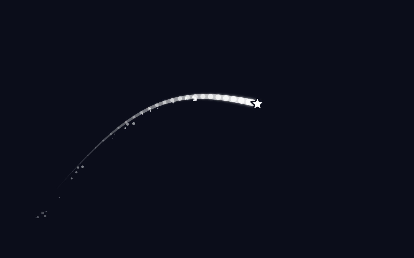
5 trendy UI effects
A star cursor with a comet tail, frosted glass panels, scroll-driven animation, smooth page transitions and gradients that actually move, plus the one tip we would give for each.
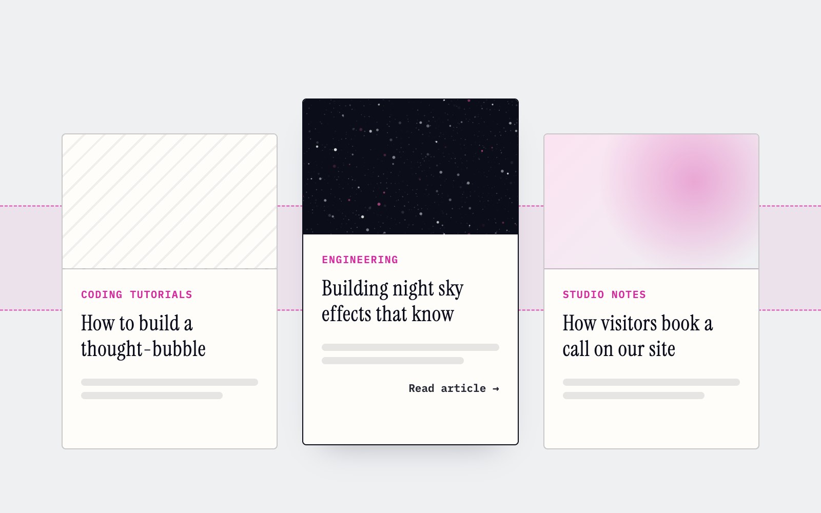
How to make cards lift as you scroll on a phone
Phones can't hover, so our blog cards used to sit flat on mobile. Here's the small CSS class and IntersectionObserver we use to lift whichever card is in the middle of the screen as you scroll.

What llms.txt is, and how we added one to our site
A plain-English look at llms.txt, the proposed markdown file that gives AI assistants a short map of your site, what it can and can't promise, and how we wrote and tested our own.
Tell Google who you are with a few lines of code
Small business names collide, and search engines have to guess which one you meant. Organization structured data is one way a site owner can stop them guessing. Here's what it is, what we put in ours, and how to test it.
How to build a thought-bubble tooltip with pure CSS
A step-by-step CSS tutorial for a tooltip that reads its label from a data attribute, pops up in a rounded bubble, trails off in three little circles and stays clickable, with no JavaScript.
Building night sky effects that know when to sit out
How the Night Sky UI Kit's star cursor, starfield and aurora check the visitor's device and settings before they draw a single frame.
How you can set up pull requests to get an automatic first review
Give every pull request an automatic first review the moment it opens, and send each new pull request and its review to a dedicated Slack channel. Here is how the pieces fit.
How visitors book a call on our site
Picking a time with us takes a few clicks and never leaves the page. Here is how the booking calendar on our site works, and the small checks that stop two people grabbing the same hour.
Inside our resumable, review-gated video production pipeline
How we built a local seven-step pipeline that turns a history topic into a captioned video, with resumable state, bounded retries, and a human review gate.